前言
Hello!小夥伴!
非常感謝您閱讀海轟的文章,倘若文中有錯誤的地方,歡迎您指出~
自我介紹 ଘ(੭ˊᵕˋ)੭
暱稱:海轟
標籤:程式猿|C++選手|學生
簡介:因C語言結識程式設計,隨後轉入計算機專業,有幸拿過國獎、省獎等,已保研。目前正在學習C++/Linux(真的真的太難了~)
學習經驗:紮實基礎 + 多做筆記 + 多敲程式碼 + 多思考 + 學好英語!
【動畫消消樂】 平時學習生活比較枯燥,無意之間對一些網頁、應用程式的過渡/載入動畫產生了濃厚的興趣,想知道具體是如何實現的? 便在空閒的時候學習下如何使用css實現一些簡單的動畫效果,文章僅供作為自己的學習筆記,記錄學習生活,爭取理解動畫的原理,多多“消滅”動畫!
效果展示

Demo程式碼
HTML
<!DOCTYPE html>

<html lang="en">

    <head>

        <meta charset="UTF-8">

        <meta http-equiv="X-UA-Compatible" content="IE=edge">

        <meta name="viewport" content="width=device-width, initial-scale=1.0">

        <link rel="stylesheet" href="style.css">

        <title>Document</title>

    </head>

    <body>

        <section><span></span></section>

    </body>

</html>
CSS
html, body {

  margin: 0;

  height: 100%;

}

body {

  display: flex;

  justify-content: center;

  align-items: center;

  background: #93b5cf;

}

section {

  width: 650px;

  height: 300px;

  padding: 10px;

  position: relative;

  display: flex;

  align-items: center;

  justify-content: center;

  border: 2px solid white;

}

span {

  position: relative;

  animation: cloud 5s ease-in-out infinite;

  background: white;

  border-radius: 50%;

  box-shadow: white 65px -15px 0 -4px, white 25px -25px, white 30px 10px, white 60px 15px 0 -10px, white 85px 5px 0 -5px;

  height: 50px;

  width: 50px;

  margin-left: -60px;

}

span:after {

  animation: cloud_shadow 5s ease-in-out infinite;

  background: black;

  border-radius: 50%;

  content: '';

  height: 15px;

  width: 120px;

  opacity: 0.2;

  position: absolute;

  left: 5px;

  bottom: -60px;

}

@keyframes cloud {

  50% {

    transform: translateY(-20px);

  }

}

@keyframes cloud_shadow {

  50% {

    transform: translateY(0px) scale(.7);

    opacity: .05;

  }

}
原理詳解
步驟1
使用span標籤,設定為
- 相對定位
- 寬度、高度均為50px
- 背景色:白色
span {

  background: white;

  height: 50px;

  width: 50px;

  position: relative;

}
效果圖如下

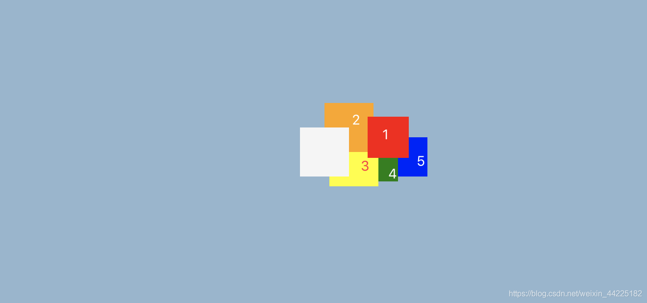
步驟2
利用box-shadow屬性,為span新增5個陰影
 box-shadow:  red 65px -15px 0 -4px,   /*陰影1*/

              orange 25px -25px,       /*陰影2*/

              yellow 30px 10px,        /*陰影3*/

              green 60px 15px 0 -10px, /*陰影4*/

              blue 85px 5px 0 -5px;    /*陰影5*/
效果圖如下
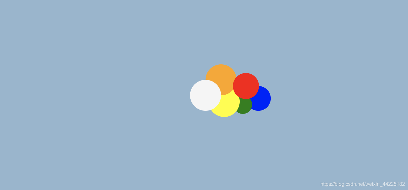
步驟3
span圓角化
span {

  border-radius: 50%;

}
效果圖如下
步驟4
將5個陰影的顏色都修改為白色
  box-shadow: white 65px -15px 0 -4px,   /*陰影1*/

              white 25px -25px,          /*陰影2*/

              white 30px 10px,           /*陰影3*/

              white 60px 15px 0 -10px,   /*陰影4*/

              white 85px 5px 0 -5px;     /*陰影5*/
效果圖如下

步驟5
將span左移60px
span {

  margin-left: -60px;

}
得到一朵小白雲

步驟6
為span新增動畫
動畫效果描述為:白雲上下移動
使用translateY屬性對span進行y軸(豎直方向)的上下移動
- 初始(0%):原位置
- 中間(50%):向上移動20px
- 末尾(100%):原位置
animation動畫程式碼為:
animation: cloud 5s ease-in-out infinite;
@keyframes cloud {

	/*忽略0% 100% 因為span需要回到原位置*/

  50% {

    transform: translateY(-20px);

  }

}
效果圖如下

步驟7
使用span::after偽元素充當白雲的陰影,設定為
- 絕對定位( left: 5px bottom: -60px)
- 高度15px 寬度120px
- 背景色:黑色
- 顏色透明度:0.2
span:after {

  background: black;

  content: '';

  height: 15px;

  width: 120px;

  opacity: 0.2;

  position: absolute;

  left: 5px;

  bottom: -60px;

}
效果圖如下

步驟8
span::after圓角化
span:after {

  border-radius: 50%;

}
效果圖如下

步驟9
為span::after新增動畫
效果
- 當白雲向上移動,陰影變小,顏色變淺;
- 向下移動,陰影變大,顏色變深
span:after {

  animation: cloud_shadow 5s ease-in-out infinite;

}
@keyframes cloud_shadow {

  50% {

    transform: translateY(20px) scale(.7);

    opacity: .05;

  }

}
最終效果圖如下
注意:從效果圖中可以發現,其實陰影部分只是大小、顏色深度在發生變化,其位置是沒有發生變化的。這是因為span動畫中50%時刻,span執行translateY(-20px),倘若span::after沒有執行translateY(20px),那麼span::after將一起移動20px。(這裡本質就是兩個效果相抵消;了,所以span::after的位置沒有發生變化)
如果span::after沒有設定translateY(20px)
那麼就會出現下面的效果:陰影上下也在移動

結語
文章僅作為學習筆記,記錄從0到1的一個過程
希望對您有所幫助,如有錯誤歡迎小夥伴指正~